
Why Your Furniture Website Is Costing You Clients in 2026 (And How to Fix It)
Squarespace Furniture Website costing you clients in 2026 and how to fix it.
Imagine scrolling through Google to find a luxury furniture maker near your city and coming across a website that is clunky, visually uninteresting, filled with pixelated images, and completely lacks the essence needed to impress a visitor whose attention span is shrinking by the year. That is the reality for far too many furniture brands operating in 2026. Our Squarespace website designers recently did a case study and found 5 common reoccurrences that were costing furniture design companies thousands of dollars in revenue. Minor changes that reflect professionalism can have a profound affect on first impressions and that turns visitors into clients.
Shrinking Attention Span in 2025- 2026
Nielsen Norman Group, via MindFeeder (2025), suggests that a website visitor forms an opinion about your website in less than 0.05 seconds of landing on your page. Most of that initial impression is driven entirely by design aesthetics and layout — not your product, not your pricing, not your story. The design comes first. Everything else is secondary.
At Boxify Web Designs, we recently reached out to several website owners in the furniture space — designers, resellers, and custom furniture builders alike. What we learned was eye-opening. The websites we examined were almost all built on Squarespace, and what stood out most was that they had been designed by the business owners themselves, not a professional design agency. Squarespace does an excellent job convincing business owners to start the design process — and for good reason, it is a capable platform. But unless you bring experience, expertise, and a clear visual design direction to the table, chances are you are going to lose out on converting visitors into customers.
Here is what we found across five randomly selected furniture websites built on Squarespace — and what you can do about it.
The Stakes Are Already Against You
Before diving into what we found, it helps to understand the conversion reality of the furniture industry. According to Smart Insights' E-commerce Conversion Rate Benchmarks (2025), home and furniture has one of the lowest average ecommerce conversion rates of any industry, sitting at just 1.4%. That means for every 100 visitors who land on your website, fewer than two are taking action. You cannot afford to lose those two because your site failed to make a professional first impression.
The good news is that this makes excellence rare — and therefore powerful. When a furniture website is designed well, it stands out immediately.
1. Personality: Your Brand Is Not Being Communicated
The first thing we noticed across these sites was the absence of a recognizable brand identity. Each website could have belonged to anyone. There was no sense of who was behind the craft.
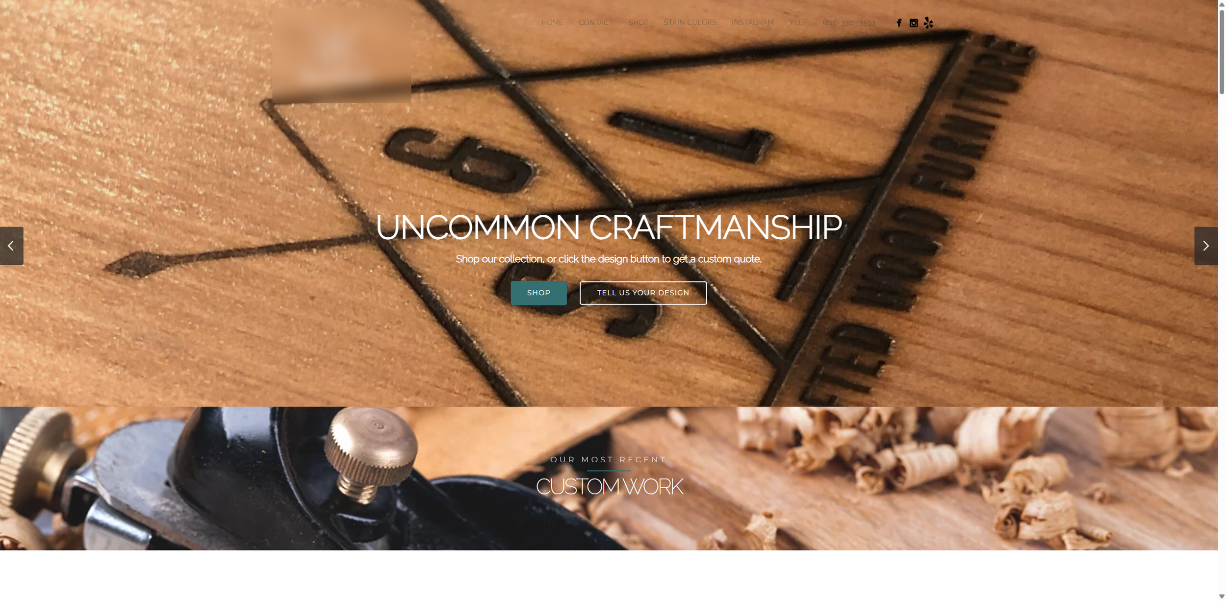
Navigation bar visibility concerns for a furniture design company website. Bad example of a website for a furniture design company
When someone is considering a custom furniture maker or a luxury designer, they are not just buying a piece of furniture. They are buying into a person, a process, and a philosophy. Your website needs to reflect that.
What was missing:
Logo Design. Several sites were using generic text-based logos with no visual design consideration. A well-crafted logo signals permanence and professionalism before a single word is read.
The Designer's Presence. High-end custom furniture is a personal product. Introducing the maker — a name, a photograph, a brief story of design experience — immediately humanizes the brand and creates a reason to trust. Luxury buyers want to know who is building for them. If that information is buried or absent, you are leaving trust on the table.
Over 70% of users trust businesses more when websites feature professional imagery, and websites with high-quality visuals convert nearly twice as well as text-only designs (NewMedia, 2026). That trust begins with showing who you are.
Wasted first impression for a furniture design company.
2. Luxury Experience: The Website Does Not Feel Luxurious
This was the most consistent issue across all five sites. If you are selling a $4,000 custom dining table, your website needs to feel like it belongs in the same world as that table. In most cases, it did not.
What was missing:
White Space. Every site felt crowded. Content was stacked too tightly, images were competing with text, and there was no breathing room for the eye to rest. White space is not wasted space — it is one of the primary visual signals of luxury. Apple built a brand on it. Muji made it a philosophy. In furniture, it communicates confidence and quality without saying a word.
Navigation and Structure. Navigation bars were cluttered with too many items, page hierarchy was inconsistent, and it was often unclear where a visitor should go next. A well-structured site guides the visitor on a deliberate journey — from discovery to desire to inquiry. Without that structure, visitors wander and leave.
Graphic Design, Photography, and Product Display. This was the most damaging gap. Product photography was inconsistent — a mix of smartphone shots, studio images, and lifestyle photos at wildly different quality levels. Furniture buyers need to see pieces in context. They need to understand scale, material, and finish. Imagery that does not deliver on those needs creates hesitation, not desire.
Typography choices influence readability and retention by up to 60%, and brands that maintain a consistent visual identity across pages see 23% more loyal visitors (NewMedia, 2026). These are not decorative decisions — they are commercial ones.
3. The Footer: A Missed Opportunity Every Time
The footer of a website is not an afterthought. For a visitor who has scrolled all the way to the bottom of your page, it is often the last moment before they decide whether to take action or leave. Every site we reviewed had a footer that was either nearly empty or disorganized.
What a professional footer should include:
Useful secondary links. Items that do not belong in your primary navigation — FAQs, care guides, material sourcing information, press features, testimonials — belong in the footer. This keeps the main navigation clean while still making the information accessible.
Contact information. Email address, phone number, and location or service area should always be visible in the footer. Hiding this information creates friction at exactly the wrong moment.
A mission statement or brand statement. A short, clearly written statement of who you are and what you stand for is not just good for visitors — it is increasingly important for AI search visibility. As AI tools like ChatGPT and Google's AI Overviews surface more answers directly in search results, having factual, clearly stated information about your business on your website helps those tools recommend you accurately and confidently (Squarespace, 7 SEO and AI Search Trends 2026).
Social media links. Connecting your website to your Instagram, Pinterest, or Houzz profile is an easy way to extend the visual experience and give visitors another touchpoint for following your work.
4. Mobile Experience: Where Most Visitors Are Already Judging You
For luxury retail specifically, 39% of purchases are completed on mobile devices (MarketingLTB, 2026). Even if a buyer ultimately calls you or visits a showroom, there is a very strong chance their first impression of your brand happened on a phone screen. Every site we reviewed fell short here.
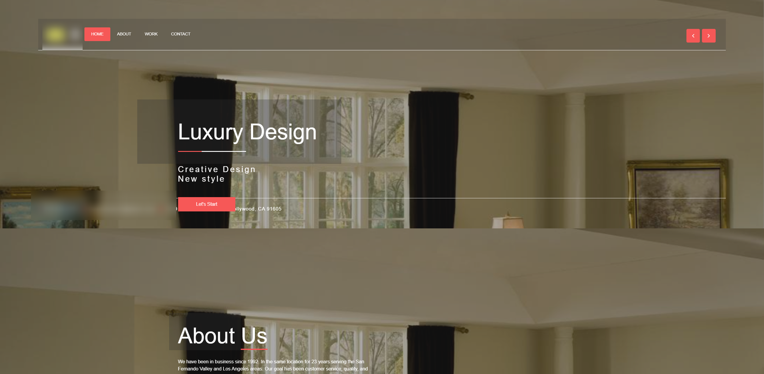
Furniture Website modernized however elements are overlapping and structure missing. Bad example of a furniture design company
What we found:
Squarespace elements were overlapping each other on mobile — text layered over images, buttons cut off, sections collapsing in ways they were not designed to. The overall experience felt generic and visually unattractive, with alignment issues that made the site feel unfinished.
This is one of the most important reasons to work with a professional Squarespace website designer for your furniture business rather than building it yourself. Squarespace's drag-and-drop editor makes it easy to build something that looks acceptable on desktop. Mobile is a different challenge entirely, requiring deliberate adjustment and testing across multiple screen sizes. When it fails, it signals to the visitor — consciously or not — that this is not a business that pays attention to detail. For a luxury furniture maker, that is a contradiction you cannot afford.
5. Website Speed and Optimization: The Silent Conversion Killer
This is the issue most furniture website owners have no idea exists. Slow websites do not just frustrate visitors — they directly cost you revenue.
Video backgrounds increase page load time by up to 2+ seconds, and large hero banners slow Largest Contentful Paint (LCP) more than any other single element (MarketingLTB, 2025). These are two of the most common design choices we see on furniture websites, and both are damaging performance silently in the background. A 1-second delay in page load can decrease conversions by 7% (SiteBuilderReport, 2026). Across a year of traffic, that number compounds into a significant revenue loss.
What we found across the five sites:
Images were not optimized or compressed. Large, uncompressed image files — often uploaded directly from a camera or design software — were dramatically slowing page load times. A product image that is 8MB when it could be 200KB is carrying four times the weight it needs to.
File size was a widespread issue. In several cases, a single page was loading over 30MB of assets. Visitors on mobile connections, which now account for over 75% of ecommerce traffic (Dynamic Yield, cited by Backlinko 2026), will not wait for that.
Video files were embedded directly rather than hosted externally. Full video files embedded directly into a Squarespace site add enormous load weight. Hosting video on YouTube or Vimeo and embedding the player instead keeps the visual experience intact while loading in a fraction of the time.
As of 2025, Squarespace automatically serves images in WebP format once uploaded — a meaningful improvement in performance. But images still need to be compressed before upload, ideally under 250KB, for the platform to work efficiently (WebsitesByKhara, Squarespace SEO Course 2026).
What This Means If You Are Hiring a Web Designer for Your Furniture Business
If you are a furniture designer, custom builder, or luxury showroom and you are ready to invest in a website that actually performs, here is what to look for when hiring a web designer for your furniture company.
Look for designers who understand the luxury buyer psychology — not just someone who knows how to use Squarespace. A professional Squarespace designer for a furniture business should know how to build trust through restraint, use photography and white space to create desire, structure navigation to guide an inquiry, and optimize every image and element for mobile and page speed before launch.
Your website is not a brochure. It is a sales tool, a trust signal, and often the first impression a high-value buyer will ever have of your brand. In an industry with a baseline conversion rate of 1.4%, the difference between a professionally designed site and a self-built one is not cosmetic — it is commercial.
Ready to See What Your Furniture Website Could Look Like?
At Boxify Web Designs, we specialize in building Squarespace websites for furniture designers and custom makers that are as intentional as the pieces you build. Whether you are looking for a luxury furniture website design in Los Angeles or anywhere across the US, we bring the same attention to craft to your digital presence that you bring to your work.
Get in touch with → Boxify Web Designs